Grab the attention of your customers!
Stand out from the crowd!
Distinguish yourself among the masses!
Now,... that's easier said than done. So I have compiled a list of "to do" when creating a flyer for your next event.
1.) Use a Heading: A heading will focus the reader quickly of what is going on in the flyer. With out a header the reader will not be able to quickly identify the reason for the flyer.
2.) Use an image: The image will enforce the headline. It is also the biggest draw to the flyer. A nice picture of an object or person will draw more attention than having many scattered images. If many images need to be placed in the flyer then group them together then create a hierarchy so the viewer knows were to look first. Remember, big images tend to be looked at first.
3.) Use simple fonts for easy reading: Good headings and images will grab and hold the viewers attention to begin reading through the flyer. Use easy to read fonts because this is the important part! Try to keep information concise and to the point. Try to not use more than 3 different fonts in the flyer.
4.) Use colors that will grab attention: Another attention grabbing item is color. Bright colors command attention. If bright colors are not in your theme or color scheme then try using complimentary colors. If you are not sure what colors are complimentary of each other use a color wheel.
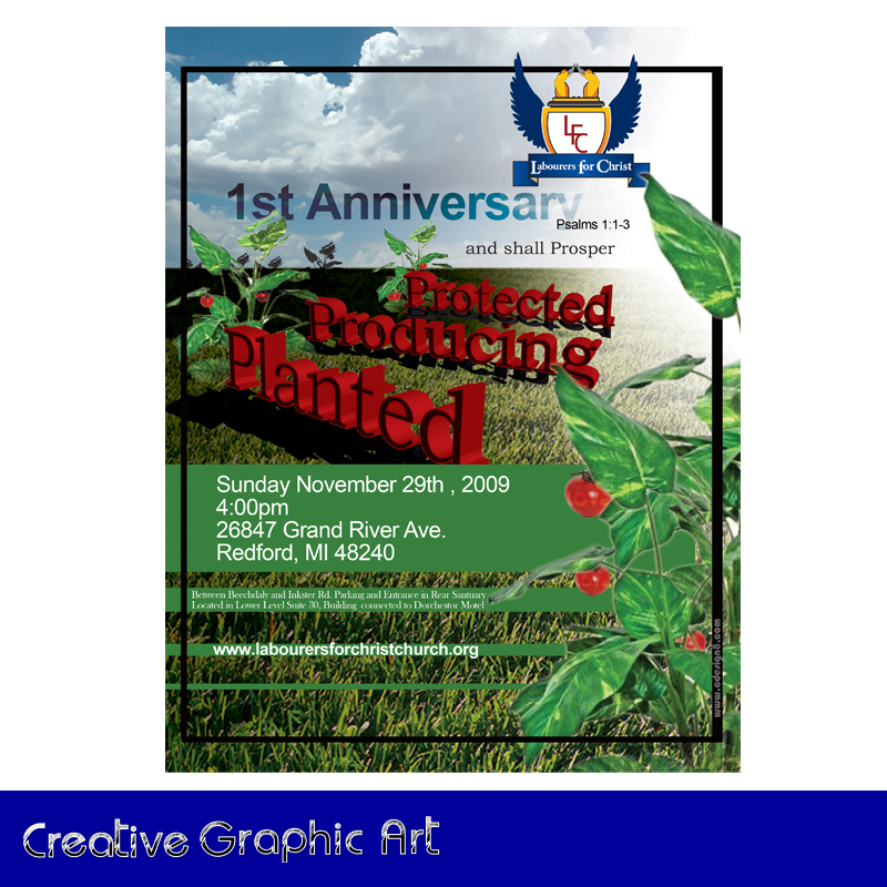
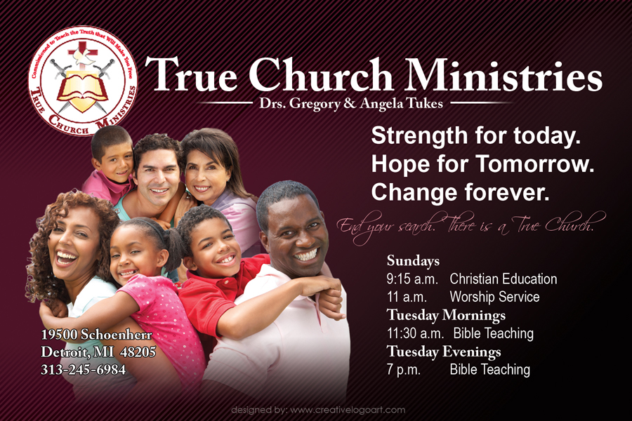
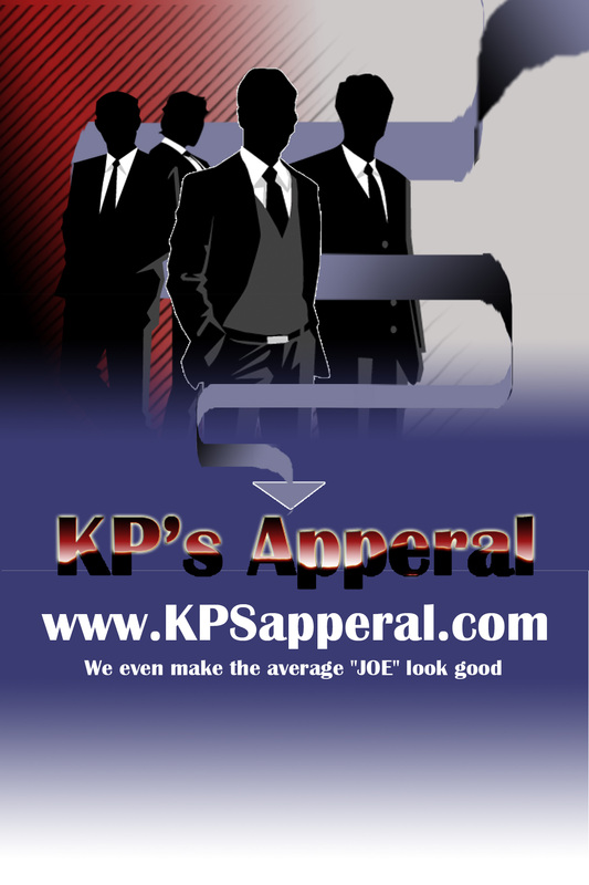
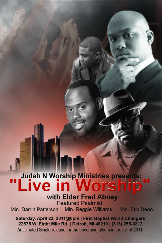
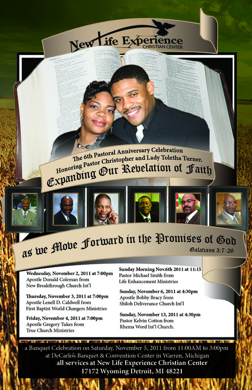
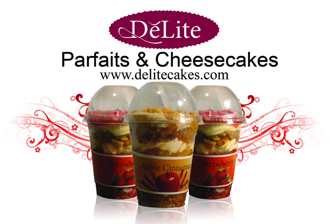
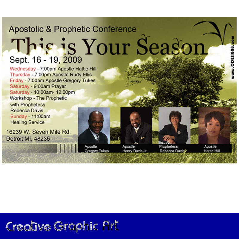
Below are some examples of flyers created by Creative Logo Art. If you would like Creative Logo Art to custom design your flyer please click here and fill out the creative brief, this month it is only $50.

 RSS Feed
